




 Shop the gift
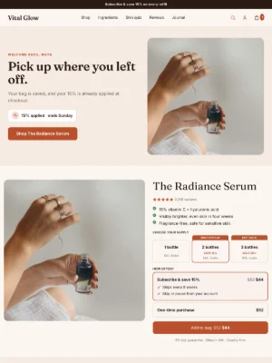
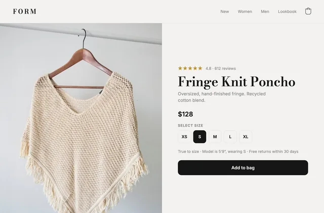
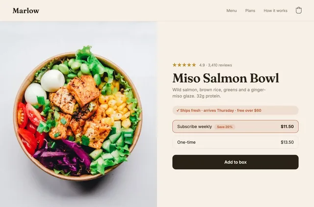


Presell page: which format to use, and when to skip it
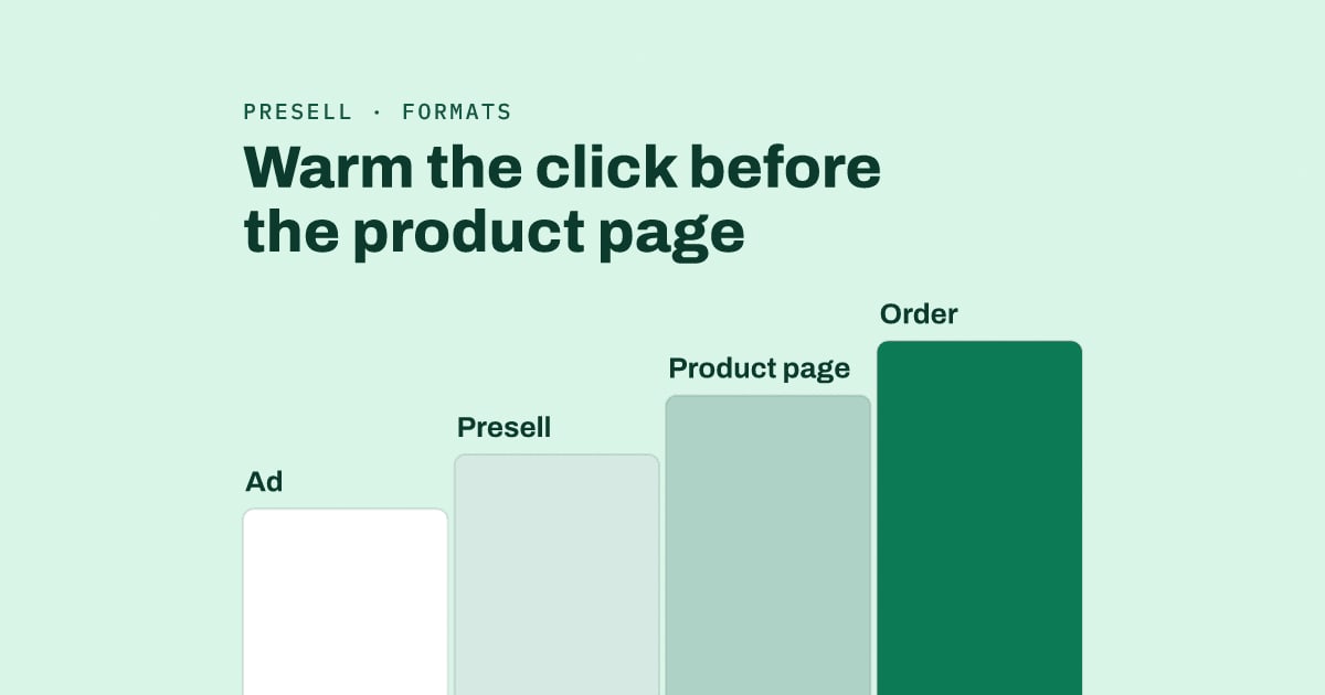
A presell page sits between an ad and the product page and answers the doubt a cold click brings before anyone asks for the sale. Brands use 4 common formats (advertorial, listicle, comparison, quiz), and the right one depends on how much the buyer already knows.
Google's ad guidance explains why the step exists: "When someone clicks on your ad, they expect to land on a page that's relevant to what they saw in your ad." Half the top guides show examples of a single format. We read the six top-ranking pages for "presell page" that could be read. None chose between the formats by what the buyer already knows, and none tested the page against the product page alone.
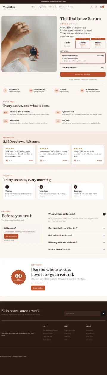
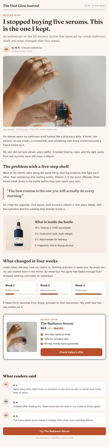
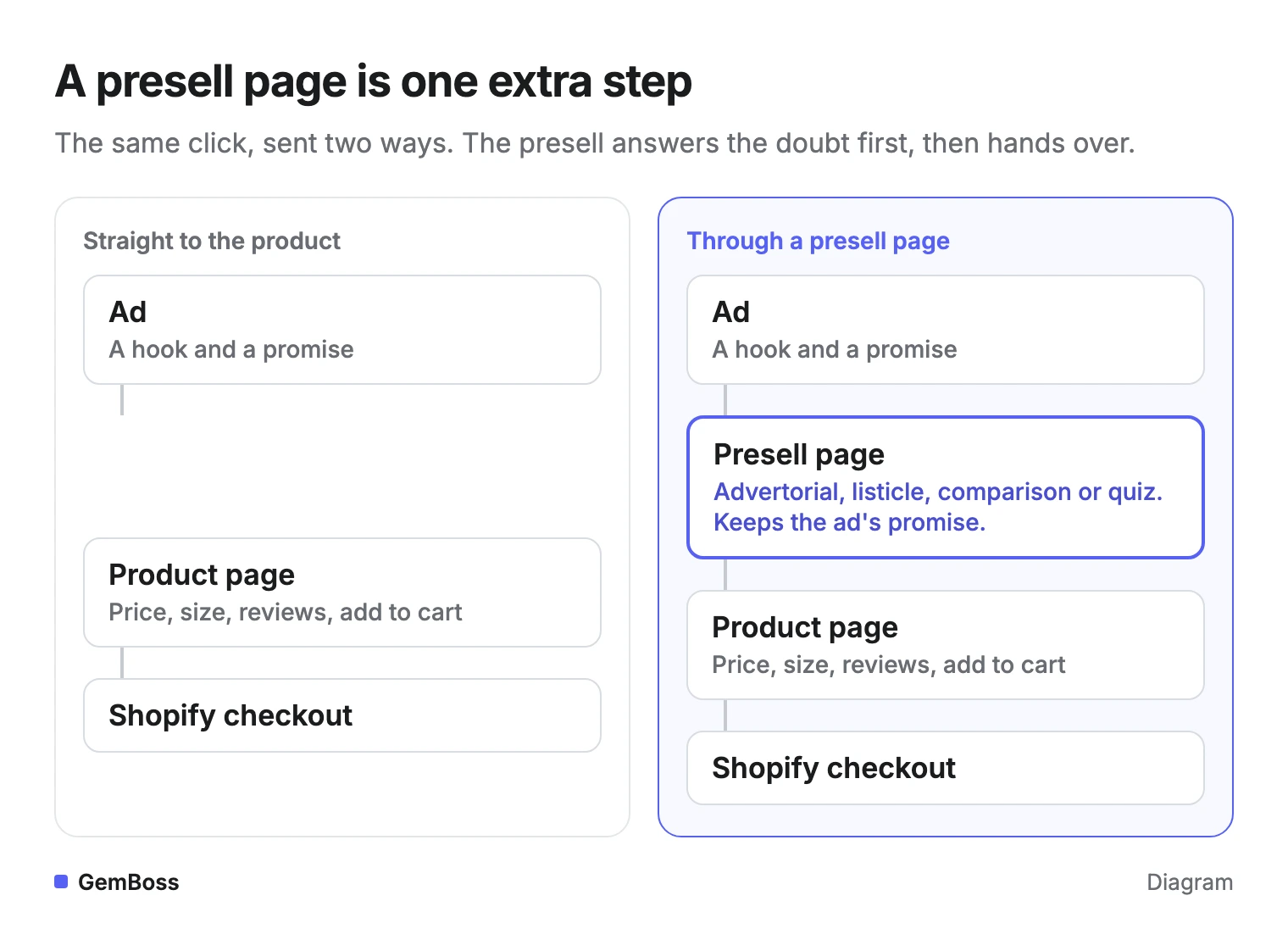
The whole idea fits in one picture: one extra page, placed between the click and the product.
Quick answer
- It sits between the ad and the product page and does the persuading a product page cannot.
- Use one for cold traffic and products that need explaining. Send people who searched for your product straight to the product page.
- Match the format to the buyer: advertorial for unaware or problem-aware readers, quiz or listicle for solution-aware ones, comparison for brand choosers.
- Label article-style pages as ads, and repeat the ad's promise in the headline.
- Test presell plus product page against the product page alone, and decide on revenue per session.
What is a presell page?
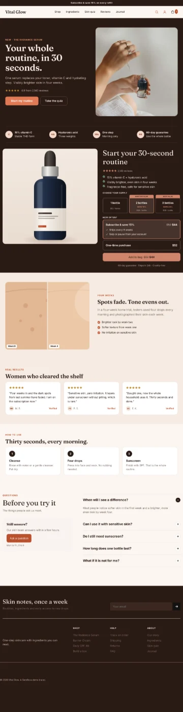
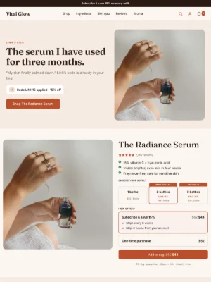
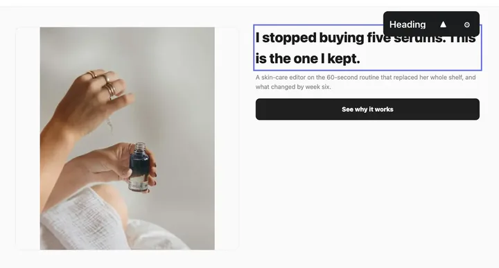
It is a landing page that sells the idea before the product page sells the item. It reads like content: a story, a list of reasons, a side-by-side table or a short quiz. Then it hands the reader to the product page or straight to the offer.
Media buyers also call it a pre-lander or a bridge page. ConvertFlow's guide treats it as another name for an advertorial or a pre-cart page, though an advertorial is only one of the four formats.
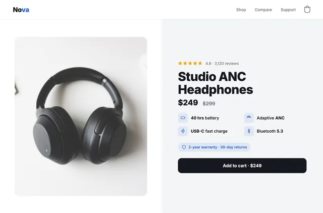
A presell page is not a presale page. A presale takes orders before a product ships, and Google's related searches for "presell page" even include crypto presale website templates. It also does a different job from your product page: the product page answers which size, how much, when does it arrive, while the presell answers why would anyone care, and why this kind of product.
Do you need a presell page?
You need one when the click is cold and the product needs explaining.
When the person already knows what they want, the extra page only adds a place to leave.
The product page is built for someone ready to choose: price, variants, reviews, add to cart. A reader who tapped an ad out of curiosity has none of those questions yet. Nick Theriot puts the rule bluntly on X: "Never send cold Facebook traffic straight to your Shopify product page. Send it to a pre-sell landing page." (post)
Three questions that settle it
Three questions settle it for most stores, asked in this order.
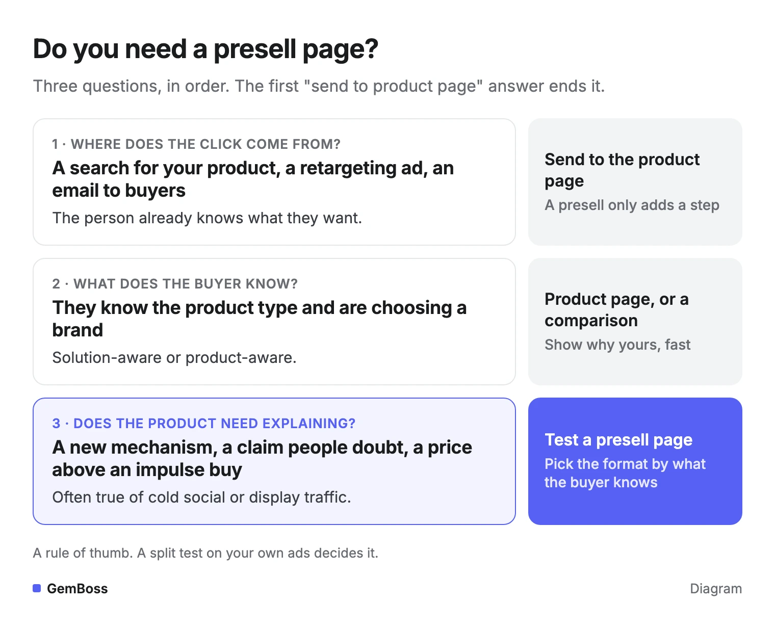
Price and novelty also push the answer toward a presell, whatever the traffic source. A refill people already understand rarely needs a story. A serum with an unfamiliar active, a supplement making a claim people doubt, or a subscription that asks for a commitment gives the reader more to resolve before the product page can do its job.
Search clicks are the exception
Search traffic is different, and it splits in two. Someone who searched your brand or product name wants the product, and Google tells advertisers to "choose a landing page that closely matches your ad and keywords." A category search can still earn a presell: ConvertFlow shows a HelloFresh ad for the query "food box" landing on a presell page, and Stitch Fix sending "subscription box" searches to a page that breaks down its features and questions.
Which presell format fits your buyer?
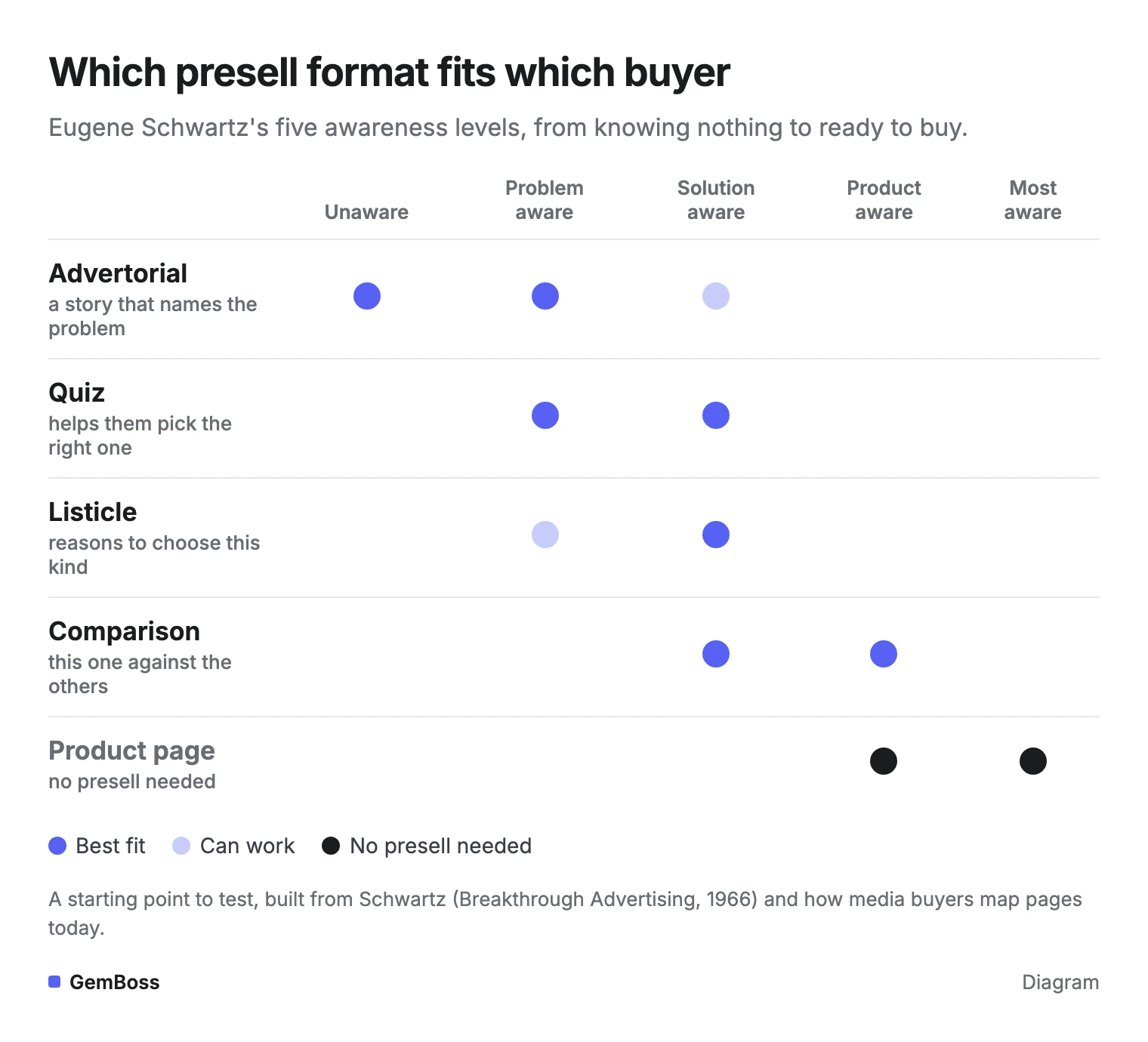
Pick the format by how much the buyer already knows. Eugene Schwartz sorted prospects into five awareness levels in Breakthrough Advertising (1966), and Copyblogger's summary lays them out from the completely unaware prospect to the most aware one, who only needs to know the deal.
In between sit three more. The problem-aware sense a problem but don't know a solution exists, the solution-aware know the result they want but haven't tied it to your product, and the product-aware know what you sell but aren't sure it suits them. Each presell format fits a different stretch of that ladder.
In a post with more than 1,200 likes, Nick Theriot maps pages to the same ladder: unaware buyers get an advertorial, problem-aware buyers an advertorial or a VSL (video sales letter), and "If buyer = solution-aware → listicle or pre-sales page" (post). Product-aware and most-aware buyers go to the product page or the offer. Read the chart from left to right: the further the buyer has come, the more direct the page can be.
The four formats side by side
| Format | What it does | Best buyer | Where the product enters | A real example |
|---|---|---|---|---|
| Advertorial | Tells a story that names the problem and explains why the usual fixes fail | Unaware, problem-aware | Late, after the story builds the case | Boom by Cindy Joseph's makeup page, broken down step by step by BDOW |
| Quiz | Asks a few questions, then recommends the product that fits the answers | Problem-aware, solution-aware with many options | At the result | Function of Beauty's quiz page for "personalized shampoo" searches, in ConvertFlow's roundup |
| Listicle | Gives numbered reasons to choose this kind of product | Solution-aware | Early in the list | Lilyrhyme's blog-style page with seven reasons, in Convert Cart's guide |
| Comparison | Sets the product beside the usual fix and other brands | Solution-aware, product-aware | Right after the comparison | Smalls' page that sets its cat food against traditional kibble brands, in Convert Cart's guide |
Whatever the format, keep one main call to action and hand over to your normal Shopify checkout.
The quiz has a second payoff. ConvertFlow notes that someone who finishes Function of Beauty's quiz without buying still leaves a lead, with their name, email and preferences. A comparison has a duty the others don't: say plainly where the other option wins, or readers may assume you hid it.
Start from the ad's hook
When you can't tell what the buyer knows, read your own ad. The hook already made a promise, and the presell has to keep it. Heyflow's guide gives the same advice, matching the format to the hook.
A story hook, such as The real reason your moisturizer stopped working, points to an advertorial. A reasons hook, such as 5 reasons runners switch insoles, points to a listicle. A which one is right for you hook points to a quiz, and a versus hook points to a comparison.
A mismatch tends to show up fast. A reader who tapped a list of reasons and lands on a long personal story may scroll for the list, fail to find it and leave.
What goes on a presell page?
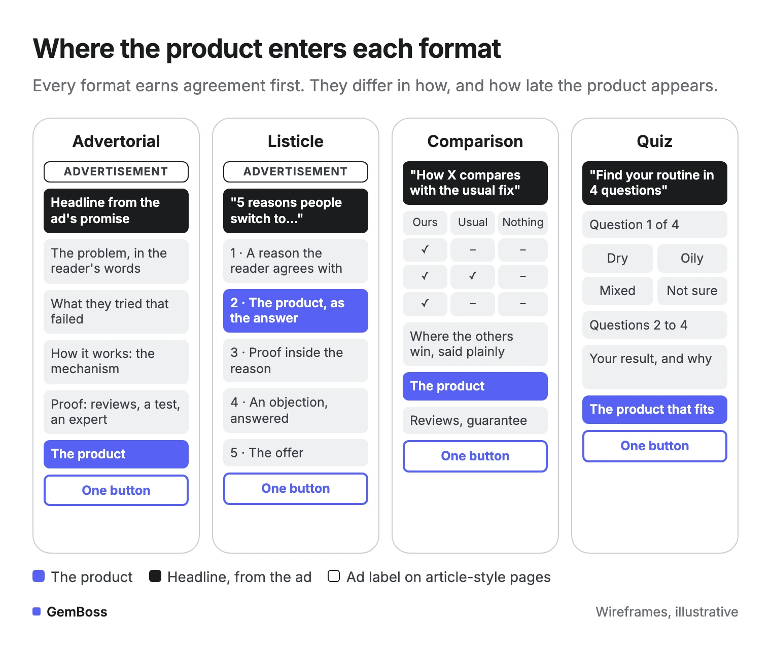
Every presell does the same five jobs, whatever the format. The order changes by format, and the jobs don't.
The formats differ in how they earn agreement and in how late the product appears.
- Repeat the ad's promise in the headline. Google asks advertisers to mirror the ad's call to action on the landing page. A reader who can't find the promise they tapped on is likely to leave.
- Name the problem or goal in the reader's words. Take the phrases from reviews, comments and support emails rather than your brand guide.
- Show how it works. Explain the mechanism: why this kind of product works where the usual fixes didn't.
- Put proof where the doubt is. Heyflow's checklist says to place social proof beside the specific claim it supports, so the answer arrives when the doubt does.
- Hand over with one button. Send the reader to the product page or the offer, at the price and offer the ad promised.
The long version of an advertorial shows how much ground it covers. BDOW's breakdown of Boom's page runs nine steps: a topic near the product, a headline, five practical tips, the product, social proof, more product detail, the founder, a testimonial and a bundle offer.
Label article-style pages
If the page reads like an article, label it as an ad. The FTC's native advertising guide says any clarifying information "must be disclosed clearly and prominently to overcome any misleading impression." In practice that means a plain "Advertisement" label above the headline, and no fake news masthead or invented expert byline.
Here is where one real page puts its label: Clarifion's advertorial for its plug-in air ionizer.
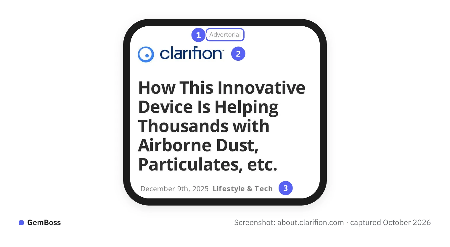
- The word "Advertorial" sits above everything else, so it comes before the headline.
- The brand's own logo, not an invented news masthead.
- A date and a section name, cues that make the page read like a news article, which is why it needs the label.
Copy where the label sits, not its word or size: use the plain word "Advertisement", in type a reader on a phone can see.
Where to send the reader next
The handoff has two good targets. Send readers to the product page when they still have a choice to make, such as a size, a shade or a bundle. Send them straight to the offer or the cart when there is one product and one price.
Either way, the price and offer must match the ad and the presell. A reader who sees a different discount on the next page may stop trusting the story that brought them there. If you are unsure, test the two handoffs like the presell itself.
How do you test a presell page against the product page?
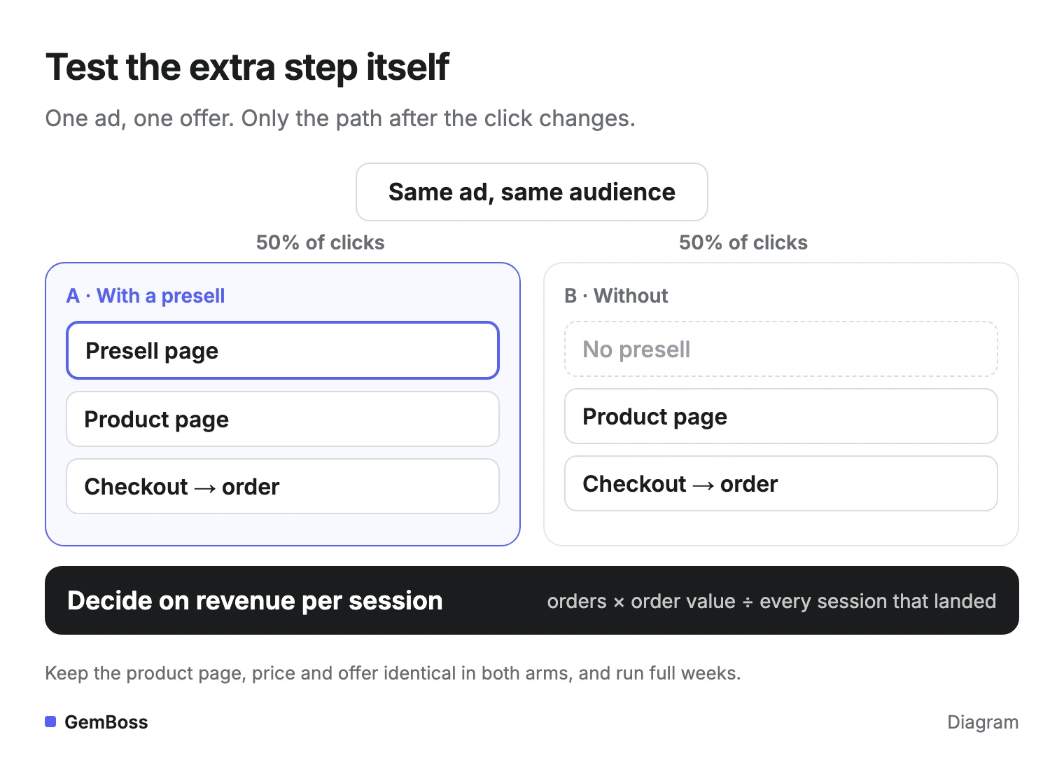
Send the same ad's clicks down two paths, presell plus product page and product page alone, and decide on revenue per session through to the order. It is the test that tells you whether the extra step pays.
Most of the testing advice in the top guides compares versions of the presell itself. That answers a smaller question. If the product page alone earns more per session, a better headline on the presell only loses money more slowly.
Here is the setup in one picture.
Five rules for a clean split
- Hold everything else still. Same ad, same audience, same product page, same price and offer. Only the path after the click changes.
- Split the clicks evenly. Use your ad platform's split test or a split on your own site, so both paths get the same mix of people and days.
- Run full weeks. Weekday and weekend shoppers behave differently, so stop on a week boundary.
- Decide how you will stop before you start. Evan Miller's classic note on A/B testing warns: "The more you peek, the more your significance levels will be off." If you want to check daily, use a method built for it, such as the always-valid tests described by Johari, Pekelis and Walsh.
- Read revenue per session for each path. Divide each path's revenue by every session that landed on it, buyers and leavers alike.
How long to run it
How long depends on two things: how many sessions each path gets, and how big the difference turns out to be. A store with a few hundred ad clicks a day may need several weeks to separate a small difference from noise. A large difference shows up sooner.
If your traffic is thin, test a bolder change. A presell against no presell is already a big change, which is one reason to run it before testing headlines.
Sellers do run this test. One, navuud, wrote on X: "i've been testing a presell page against direct to product page the results: 23% lift in landing page conversion rate" (post). That is one store's result, and it is a landing page conversion rate, a number that can rise while revenue per session falls. With no data team, the A/B testing playbook walks through running this kind of test on Shopify.
Which number decides a presell test?
Revenue per session through to the order decides it. Click-through from the presell to the product page only tells you the page held attention.
The two can move in opposite directions. A presell that promises more than the product page delivers can send more people onward and sell to fewer of them. A page that filters out the curious can send fewer people onward and sell more to those who arrive. Revenue per session counts both how many bought and how much they spent, across the whole path.
Each step's number answers a different question.
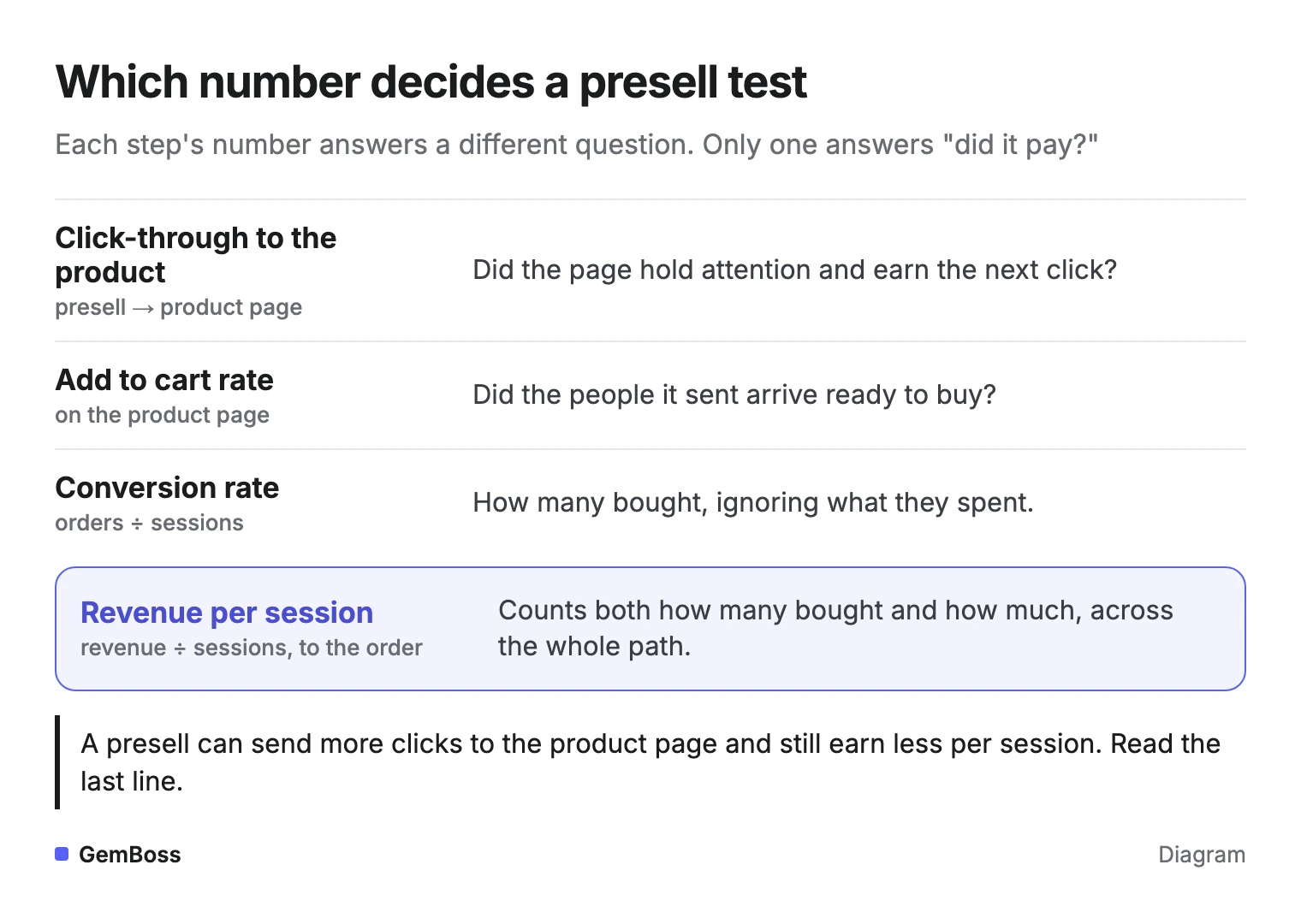
Here is an illustration with made-up numbers. Path A gets 1,000 sessions and 30 orders at $60, so it earns $1.80 per session. Path B gets 1,000 sessions and 36 orders at $45, so it earns $1.62. Path B converts more, and Path A pays more.
Convert Cart's guide calls micro-conversions, such as product page views, "the ultimate metric to determine the success of pre-sell pages." Those numbers help you fix the page: a drop between item three and item four, or a headline nobody scrolls past. They cannot tell you whether the page earned its place.
Use the step numbers to find the leak, and the revenue number to make the call. If the leak is the product page itself, fix that page first.
How we checked
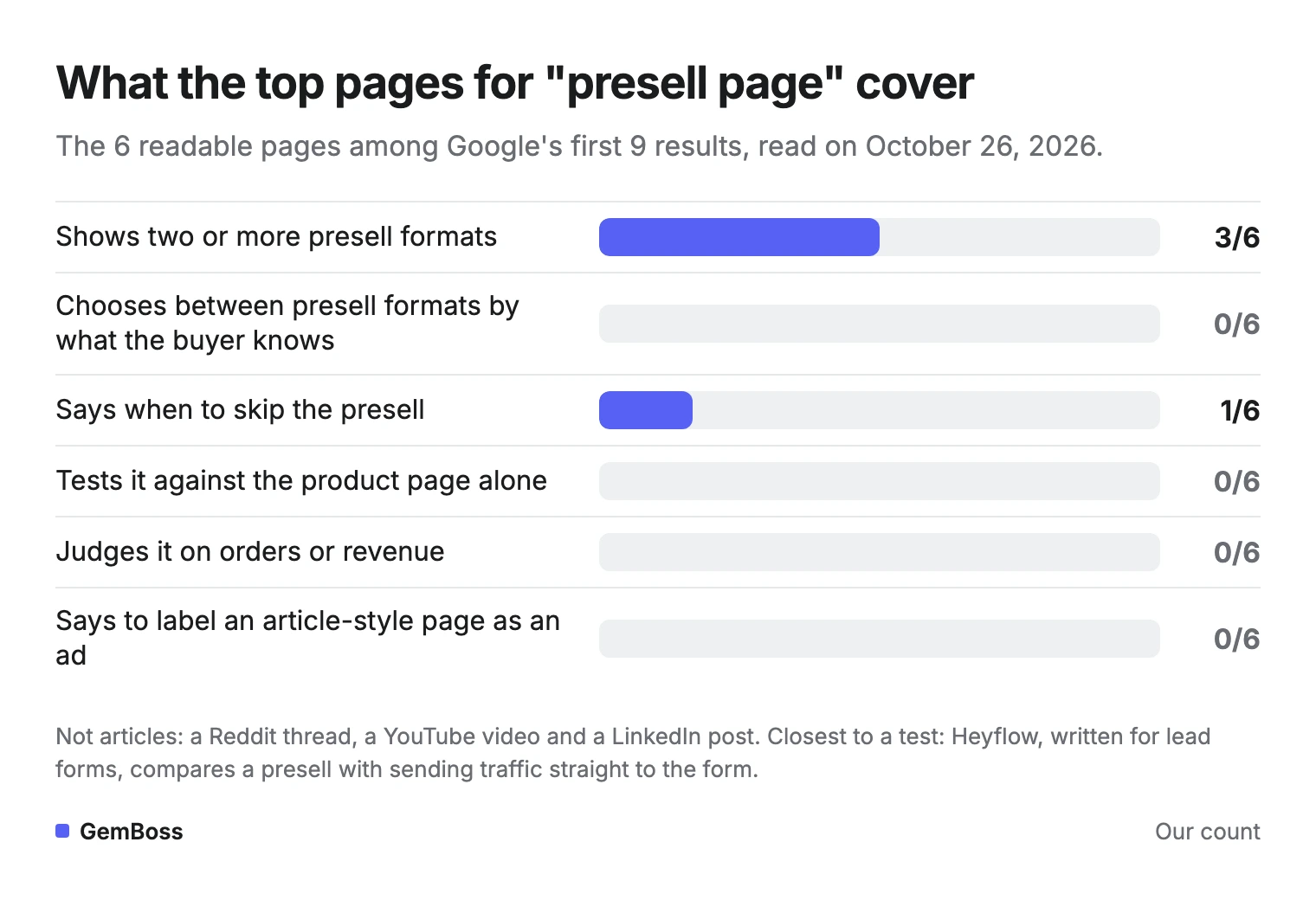
On October 26, 2026 we took the nine organic results on Google's first page for "presell page" and read every one that is an article. Six are articles. A Reddit thread, a YouTube video and a LinkedIn post are not, so they are left out.
For each of the six pages we marked six things, worded exactly as in the chart:
- shows two or more presell formats
- chooses between presell formats by what the buyer knows
- says when to skip the presell
- tests it against the product page alone
- judges it on orders or revenue
- says to label an article-style page as an ad
The pages are strong on examples and weak on the decision.
What the count shows
Three pages show more than one format: ConvertFlow (a quiz-based page among its examples), Convert Cart (blog-style, comparison and quiz-result pages) and Heyflow (advertorials, listicles, comparison pages and quizzes). GoCardless lists click-through, lead-generation and product-highlight pages, but it treats presell as presale, so it is not counted.
Heyflow is also the one page that says when to skip: cold traffic gets a presell, warm traffic a shorter landing page, and hot traffic goes straight to the form or product page. It picks the format by the ad's hook and by industry rather than by what the buyer knows. Convert Cart tailors pages to aware and unaware shoppers without choosing a format.
None of the six tests the presell against the product page alone. The closest is Heyflow, written for lead forms, which compares the presell with the direct-to-form version on conversion rate and cost per lead. The other two pages, from BDOW and Studio1 Design, focus on examples and copy.
How GemBoss handles this
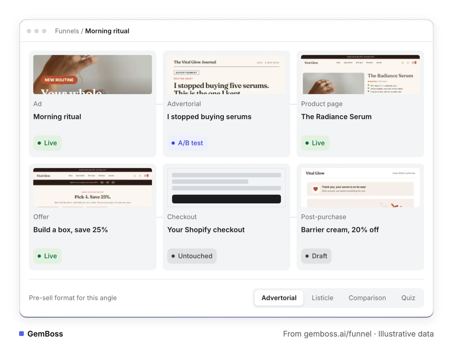
GemBoss treats the presell as one step of a funnel. Give it a product and it writes the angles. Then it builds the path each angle needs, from the pre-sell page to the step after checkout (funnel builder).
Every angle carries a hook, a persona and an awareness level, and its pre-sell page can be an advertorial, a listicle, a comparison or a quiz. Any step can be tested, and every test is read on revenue per session through to the order (how the engine works). The tests use always-valid sequential statistics, so they are safe to check any day.
Pages and tests are staged for a person, and a winner waits for you to promote it. GemBoss writes the angles, the ad copy and the landing URLs; you run the campaigns in your own Meta, TikTok or Google account. Here is one angle's path from the demo store on gemboss.ai, with the format switch at the bottom.
When GemBoss is the wrong tool
It is the wrong tool if you only need one page inside your current Liquid theme: a page builder such as GemPages (GemPages is our sister product) does that inside Shopify. If you run no paid traffic yet, a presell has nobody to warm up, and if most buyers arrive by searching your product name, improve the product page first.
Plans start at $49 a month with a 14-day free trial (pricing).
Frequently asked questions
Is a presell page the same as a presale page?
No. A presell warms up a reader before they see a product that is already for sale. A presale page takes orders or deposits before a product ships, and the term is also used for crypto token sales: Google's related searches for "presell page" include crypto presale website templates.
How long should a presell page be?
Long enough to answer the doubt the ad raised, and no longer. An advertorial for an unaware reader runs longest, because it has to name the problem and explain the mechanism. A listicle is shorter, and a quiz is a few questions and a result. Check where readers stop with a scroll map before adding more, and keep an image-heavy page fast on phones.
Can I build a presell page for free?
Yes. In Shopify you can create a page and give it its own page template in your theme, then send your ad to it (Shopify Help: templates). The real cost is the writing and the test: you need enough paid clicks on both paths to read revenue per session with confidence.
Do I need to label a presell as an ad?
If it looks like an article, yes. The FTC's guide asks for a disclosure clear and prominent enough to correct any misleading impression, and a plain "Advertisement" label above the headline does that. A quiz or comparison page that is plainly the brand's own usually needs no extra label, as long as it doesn't pose as an independent review.
Where can I find presell page examples and templates?
ConvertFlow's roundup breaks down six brand presell pages and ends with a section of templates. BDOW walks through Boom's advertorial step by step and links a presell page template. Convert Cart shows blog-style, comparison and quiz-result pages from brands such as Lilyrhyme, Smalls and Annmarie Gianni.
Do presell pages work with Google Ads?
They can, for category searches. ConvertFlow's examples are mostly Google ads for category terms, such as HelloFresh for "food box" and Urban Decay for "vegan makeup", landing on presell pages. For searches of your brand or product name, Google's advice to pick the landing page that best matches the ad and keywords points to the product page.
Sources
- Optimize your ads and landing pages · Google Ads Help
- Native Advertising: A Guide for Businesses · U.S. Federal Trade Commission, December 2015
- The 5 Types of Online Prospects, and How to Sell on a Blog · Brian Clark, Copyblogger (on Eugene Schwartz, Breakthrough Advertising, 1966)
- How Not To Run an A/B Test · Evan Miller, April 18, 2010
- Always Valid Inference: Bringing Sequential Analysis to A/B Testing · Ramesh Johari, Leo Pekelis, David J. Walsh, arXiv
- 6 Ecommerce Presell Page Examples · ConvertFlow
- Ecommerce Presell Page Strategy · BDOW, updated April 30, 2025
- Building a Kickass Pre-Sell Page: 11 Key Things · Convert Cart, updated July 29, 2025
- How to Make a Cold Traffic Campaign Work With Presell Pages · Heyflow
- How To Create A Presell Page with Examples · GoCardless
- How To Supercharge Your eCommerce Website Using Presell Pages · Studio1 Design
- Templates · Shopify Help Center
- Nick Theriot and navuud on X (posts linked in the text)
- Screenshot of Clarifion, captured October 2026 · Clarifion
A store you own, run for you
See GemBoss build on your brand. Open framework, your data, no lock-in, and keep optimizing it every week.
Request a demo →Want this every morning? GemNews puts a Shopify and AI briefing in every new tab, free.