




 Shop the gift


Listicle landing page: build it, then test it to the order
A listicle landing page is a numbered list of reasons, such as *5 reasons sleepers switch pillows*, that an ad sends people to before the product page. It works best when the reader wants this kind of product, and it should be judged on revenue per session through to the order.
We read the eight pages Google ranks for "listicle landing page" and counted seven, leaving out our sister product's page. Five tell you to A/B test the page, and none says to read that test on revenue per session through to the order.
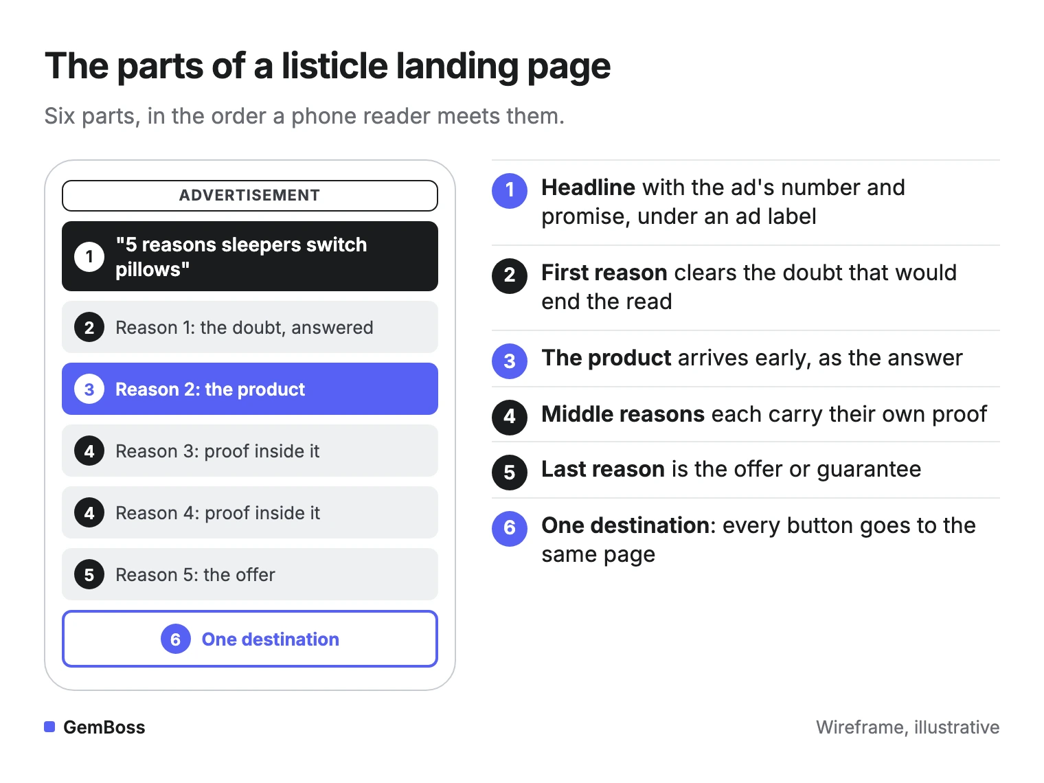
A listicle landing page that sells usually has six parts, in this order.
What is a listicle landing page?
A listicle landing page is a presell page written as a numbered list, where every reason points to the same product. ConvertFlow describes it as a type of advertorial landing page, a hybrid between a sales page and a blog post.
It is different from an editorial listicle, the "10 best" article a publisher writes for search. A landing page listicle sells one product with one offer, and it exists because an ad sent someone there.
Here is a real one on a phone: Ridge's listicle for its wallet.
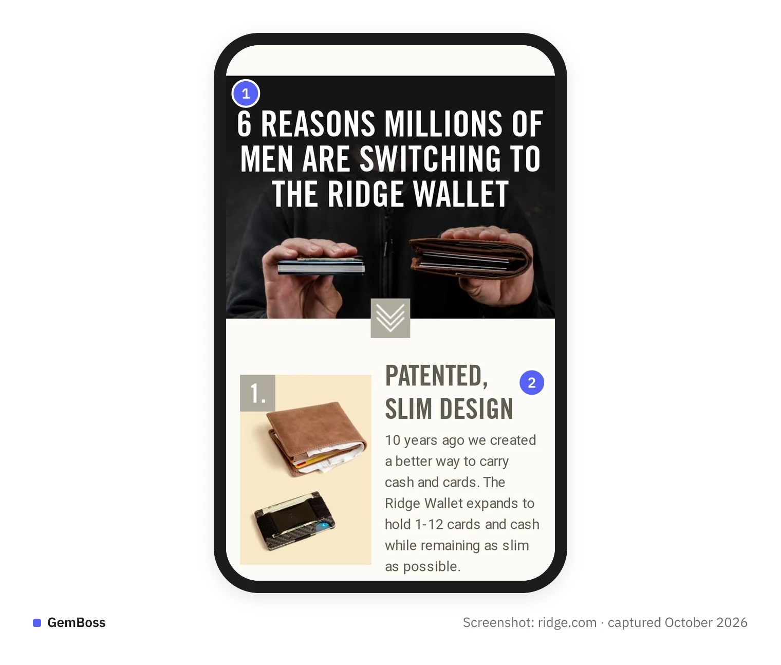
- The headline carries the count and the promise: six reasons, and a claim that millions of men are switching.
- Each reason gets its own number, photo and a few lines of copy.
Sellers use a listicle as the step between a curious click and a plain product page. On X, Rudolfs described a pet supply store's path this way: "They push to a simple '7 reasons why...' listicle Then you end up on the sales page" (post).
When does a listicle beat an advertorial or the product page?
A listicle wins when the reader already accepts this kind of product and is choosing which one to buy. Nick Theriot's rule of thumb on X puts it plainly: "If buyer = solution-aware → listicle or pre-sales page" (post).
Not everyone agrees on where the line sits. PageDeck's guide says "Listicles win on cold, problem-aware traffic," a step earlier on the ladder. Both put the listicle before the buyer knows your product.
The real question is whether the reader accepts the kind of product. A list of reasons assumes they do. If they don't, an advertorial that explains the problem and how the fix works usually has to come first.
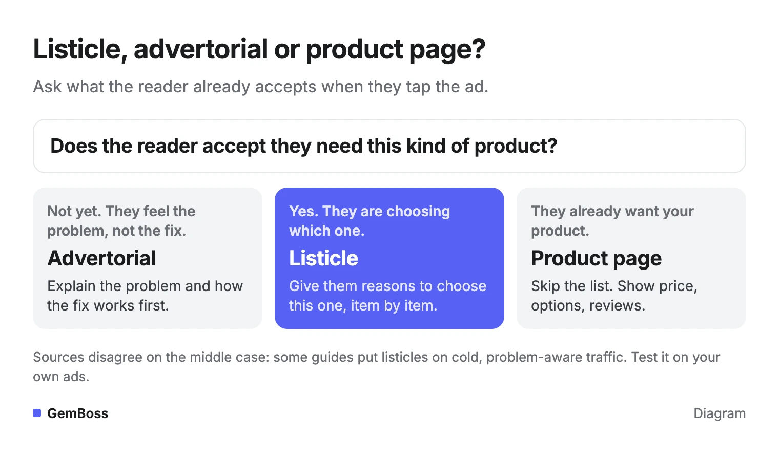
Retargeting and branded search are the clear cases for skipping it. PageDeck puts it well: "A listicle behind a retargeting ad is a slower path to the same cart." When the guides disagree, run both formats behind the same ad and let revenue per session decide.
How do you build a listicle landing page?
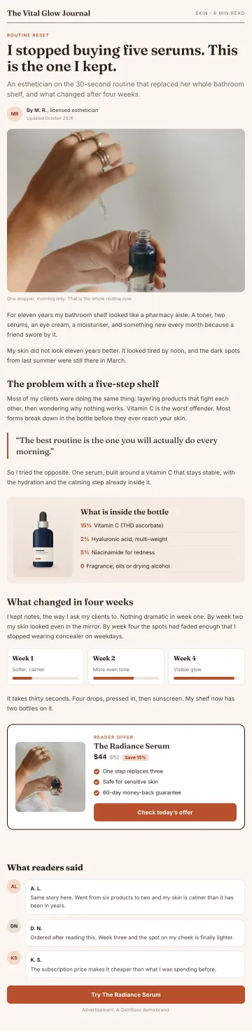
Build it in six parts, numbered here to match the picture above.
- Headline with the ad's number and promise. Use the same number and promise the ad used. Put an "Advertisement" label above it, because the page reads like content. The FTC's native advertising guide says clarifying information "must be disclosed clearly and prominently to overcome any misleading impression."
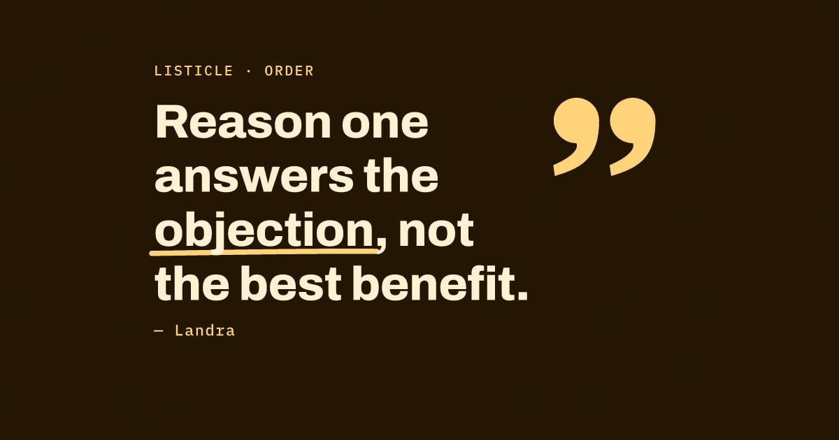
- A first reason that clears the doubt. Landra's library of 34 brand listicles found that "Reason one answers the objection, not the best benefit." Its teardown of Venus ET Fleur shows exactly that.
- The product, early, as the answer. PageDeck recommends bringing it in at reason two or three. Treat that as a starting point to test, as the example further down shows.
- Middle reasons that carry their own proof. Place each review or test result next to the claim it backs. Landra notes that Blissy stacks social proof under each reason.
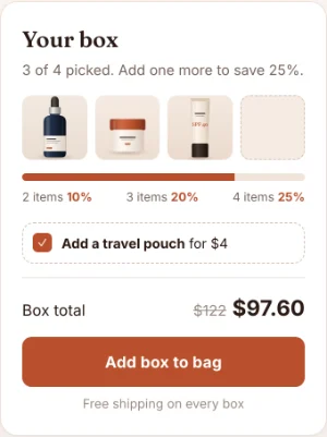
- A last reason that is the offer. Landra shows Obvi turning its guarantee and its offer into reasons.
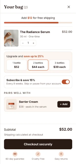
- One destination. Every button goes to the same product page or cart, at the price and offer the ad promised.
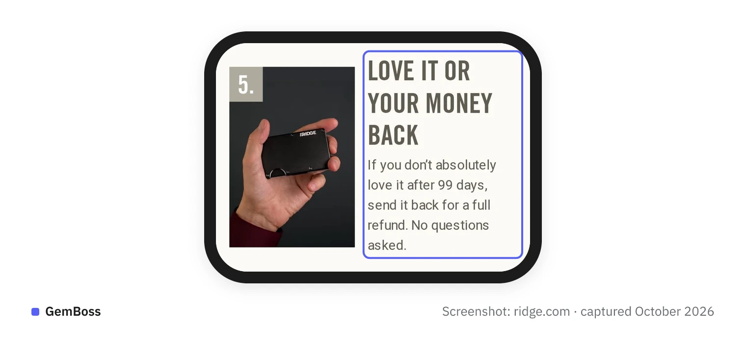
Like Obvi, Ridge turns its guarantee into a reason, the fifth of six.
How many reasons to use
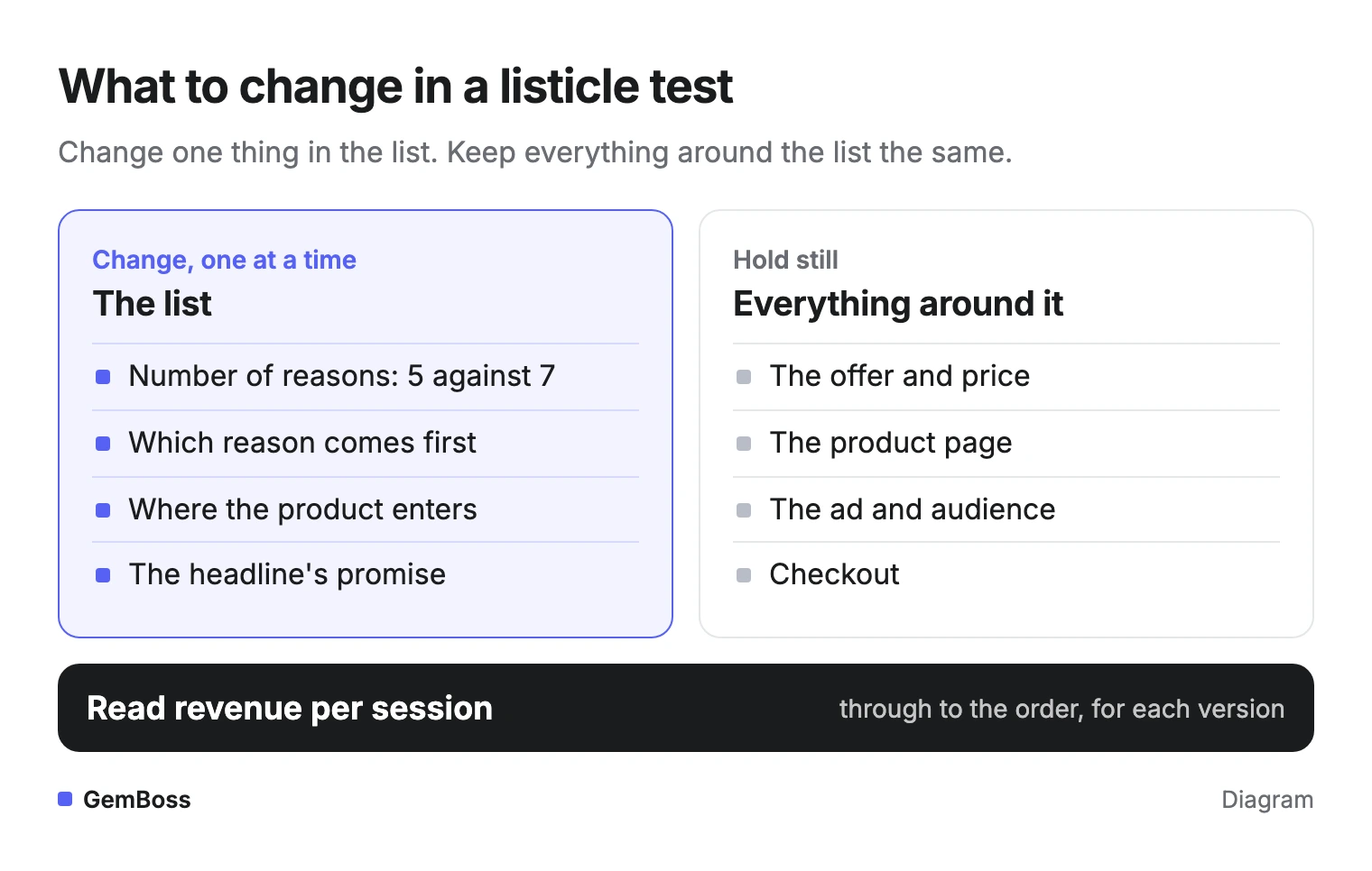
How many reasons is a test, not a rule. PageDeck suggests testing 5 against 7 with the first five identical, and Swipe Pages pitches a test of five items against nine.
Two public examples show the range. ConvertFlow walks through The Earthling Co.'s shampoo bar listicle, five benefits with bold headers and a big call to action at the bottom. Convert Cart shows Lilyrhyme's blog-style page with seven reasons and comparison charts.
How do you test a listicle landing page?
Change one thing in the list, hold everything around it still, and read revenue per session through to the order. If the offer or product page changes too, you can't tell which change earned the result. Here is what to change and what to leave alone.
Split the clicks evenly between versions, run full weeks, and decide before you start how you will stop. Evan Miller's note on A/B testing explains why checking early and stopping on a good day produces false winners. The A/B testing playbook covers the setup on Shopify without a data team.
Landra captured several versions of one listicle running at once from Ridge, and notes that winning lists get forked into new ones rather than rewritten.
When the drop-off is the problem
Sometimes the test you need is bigger than a list change. Lukas, who posts a daily log of his US store on X, wrote: "got plenty of visitors to the listicle but there's a huge dropoff from the listicle to the product page" (post). His next step was to send the same traffic straight to the product page and compare. That is the right test when readers stop before the product page.
When readers finish the list and don't buy, check three places. First, check that the product page matches the price and promise of the ad and the list. Then ask whether the list pulled curious readers who were never going to buy, and whether the product page is slow or unclear.
Which number decides a listicle test?
Revenue per session through to the order decides it. Scroll depth and click-through to the product page tell you where to fix the page, and they can point the wrong way on which version to keep.
Scroll maps are good at the first job. They show which reason loses readers, and heatmaps on a long page make that visible.
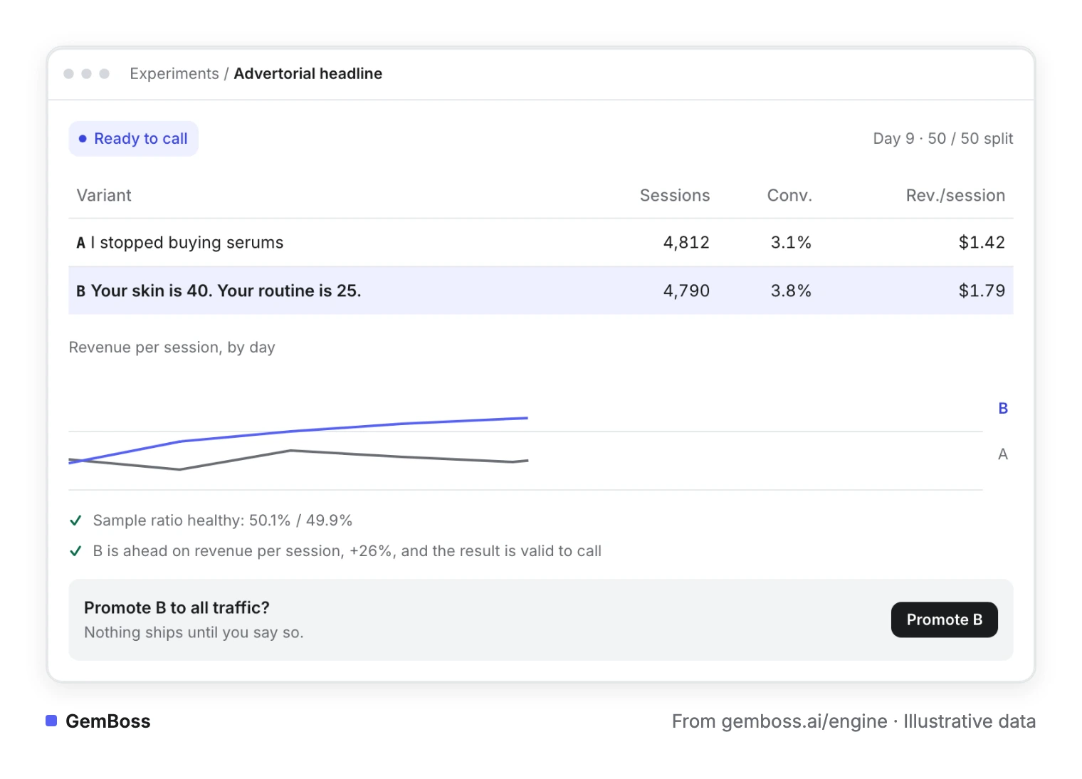
The second job needs the order data. In this example, with made-up numbers, the version that sends fewer people to the product page earns more.
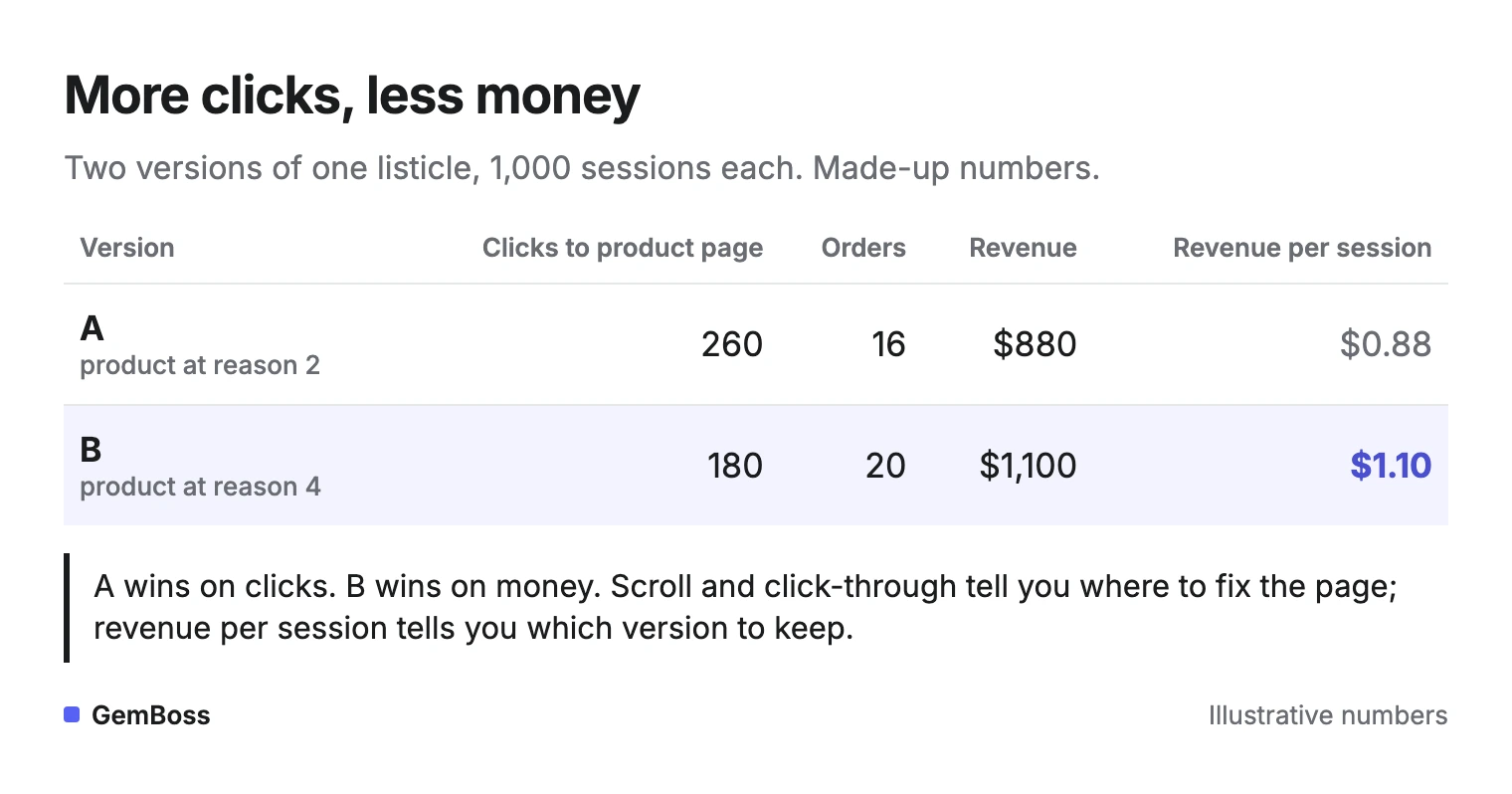
Version B sent fewer readers onward, and more of them bought. A list that brings the product in later can do that: by the time the reader reaches it, the remaining doubts are gone, and the curious have already left. Only revenue per session sees both effects at once.
If the product page is where people leave, fix that page before the list. The usual causes are covered in why AI-built stores don't convert, and a long, image-heavy list needs fast page loads on phones.
How we checked
On October 26, 2026 we took the eight results Google showed for "listicle landing page". One is from GemPages (GemPages is our sister product), so we left it out and read the other seven.
For each page we marked six things, worded exactly as in the chart below.
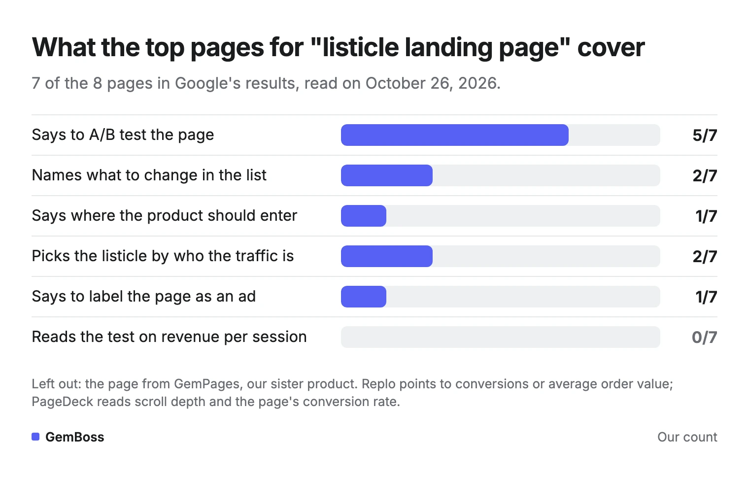
PageDeck is the most complete: it covers testing, where the product enters, traffic temperature and the ad label, and it measures with scroll depth and the page's conversion rate. Swipe Pages names a list-length test and counts offer-button taps as the win.
Replo points to conversions or average order value, BMG360 to conversion rate, and Marketing Examined names no number. ConvertFlow focuses on examples but aims the listicle at top-of-funnel traffic, and Landra focuses on examples.
How GemBoss handles this
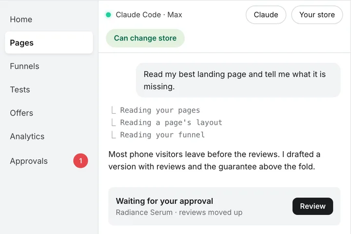
GemBoss builds the listicle as one step of a funnel. Every angle it writes carries a hook, a persona and an awareness level, and the pre-sell page can be an advertorial, listicle, comparison or quiz (funnel builder).
Any step can be tested, and every test is read on revenue per session through to the order (A/B testing). The tests use always-valid sequential statistics, so they are safe to check any day. A test winner waits for a person to promote it. Here is how a test reads, on demo data from gemboss.ai.
GemBoss writes the angles, ad copy and landing URLs; you run the campaigns in your own ad accounts. If you only need a single listicle inside your current Liquid theme, a page builder such as GemPages is simpler. Plans start at $49 a month with a 14-day free trial (pricing).
Frequently asked questions
What is an example of a listicle landing page?
ConvertFlow walks through Jones Road Beauty's listicle for mature skin and The Earthling Co.'s listicle for its shampoo bars. Both are numbered lists of reasons with a clear call to shop. Landra keeps a library of 34 brand listicles with notes on what each one does.
How many reasons should a listicle have?
Five is the common default, and the right number is a test. Keep the first reasons identical and compare a shorter list with a longer one, such as 5 against 7. Read the result on revenue per session, because a longer list can lose readers and still sell more to those who stay.
Can AI build a listicle landing page?
Yes, AI tools can draft the reasons, the headline and the layout. You still need to check every claim against your product, keep the ad's promise, and test the page. A draft that reads well is not proof that it sells.
Do I need to label a listicle landing page as an ad?
Yes, if it reads like an article. The FTC's guide asks for disclosure that is clear and prominent enough to overcome a misleading impression, and a plain "Advertisement" label above the headline is the simplest way to make that clear. Skip invented author names and press logos you haven't earned.
Is there a free listicle landing page template?
You can build one free in Shopify by creating a page with its own page template and duplicating it for each angle. Most page builders also ship listicle templates. The template matters less than the order of the reasons and the test you run on it.
Sources
- 6 Listicle Landing Page Examples · ConvertFlow
- Listicle Landing Pages: Why Listicles Convert Cold Traffic · PageDeck
- Listicle landing page examples · Landra
- Listicle pages · Swipe Pages
- Top listicle examples · Replo, published January 7, 2026
- 5 Landing Page Types To Test · Marketing Examined
- 6 Landing Page Templates · BMG360
- Building a Kickass Pre-Sell Page · Convert Cart
- Native Advertising: A Guide for Businesses · U.S. Federal Trade Commission, December 2015
- How Not To Run an A/B Test · Evan Miller, April 18, 2010
- Rudolfs, Nick Theriot and Lukas on X (posts linked in the text)
- Screenshot of Ridge, captured October 2026 · Ridge
A store you own, run for you
See GemBoss build on your brand. Open framework, your data, no lock-in, and keep optimizing it every week.
Request a demo →Want this every morning? GemNews puts a Shopify and AI briefing in every new tab, free.